It often doesn’t have to be fancy. Boring is good. It’s tried and tested to work.
Sometimes it’s about getting the message across as coherently and quickly as possible.
Modern day humans have very low attention spans (think about the frustration you get after a website hasn’t loaded after 5 seconds!). If I have to try and figure out something and it takes me longer than a second to do so, I’m gone.
But if it’s an ad for an agency that provides a service I’m looking for, and they have a banner that looks simple and clear like this, I’m liable to notice and give them a call.


It’s worse; it’s plain and boring. Nothing about it attracts attention. The seemingly incongruous first version draws your attention.
I mean legibility, but I agree. We wouldn’t even be having this conversation had it been aligned like my image.
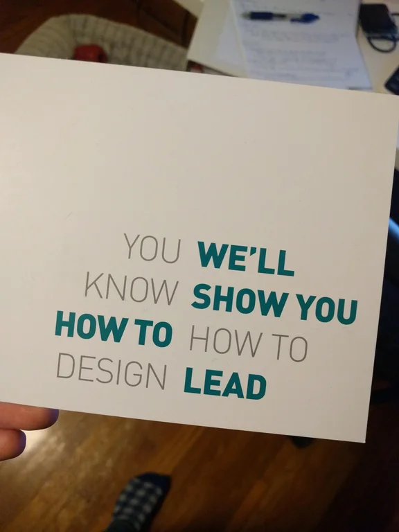
It often doesn’t have to be fancy. Boring is good. It’s tried and tested to work.
Sometimes it’s about getting the message across as coherently and quickly as possible.
Modern day humans have very low attention spans (think about the frustration you get after a website hasn’t loaded after 5 seconds!). If I have to try and figure out something and it takes me longer than a second to do so, I’m gone.
But if it’s an ad for an agency that provides a service I’m looking for, and they have a banner that looks simple and clear like this, I’m liable to notice and give them a call.