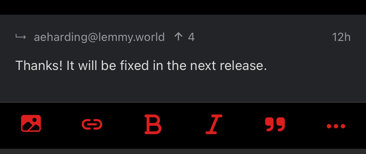
This is on the most recent iPhone version and the most recent Voyager version. My text size is set as large as possible without the accessibility sizes being on (honestly I would go larger, but accessibility sizes are a bit too big). Making the text this big makes the button to select photos pushed off to the left, and the three dots button is pushed off to the right. They will let me interact with them if I tap as far to the left/right as possible, but I didn’t realize I was missing UI elements until someone mentioned it.
Sorry if this has already been reported, I tried searching the github issues but I’m not sure I know the right keywords to use. Thanks for all the work you do on this app! 🙏


Thanks! It will be fixed in the next release.
Awesome, thanks!
they are still quite large in 1.32.6 and the B and I seem bigger than the icons. Sorry for being picky.
Contributions are welcome. Right now I’m using mismatched SVG icons because I’m not a designer.