
Official announcement : https://www.iamtorontopearson.com/news-and-events/check-out-the-new-i-am-toronto-pearson
Project page : https://www.madebyemblem.com/project/toronto-pearson
“IATP Hype Video” (their own words) : https://www.youtube.com/watch?v=tvj6aS3UPPE
Toronto Pearson Airport is Canada’s biggest and most heavily used airport accounting for 60% of the country’s international arrivals. A pillar of Pearson’s strategy coming out of the pandemic is employee acquisition and retention. “I AM TORONTO PEARSON” (IATP) is a brand developed by Pearson in 2016 to serve the community of over 50,000 employees and required a refresh to facilitate their new plans in growing and celebrating that community.
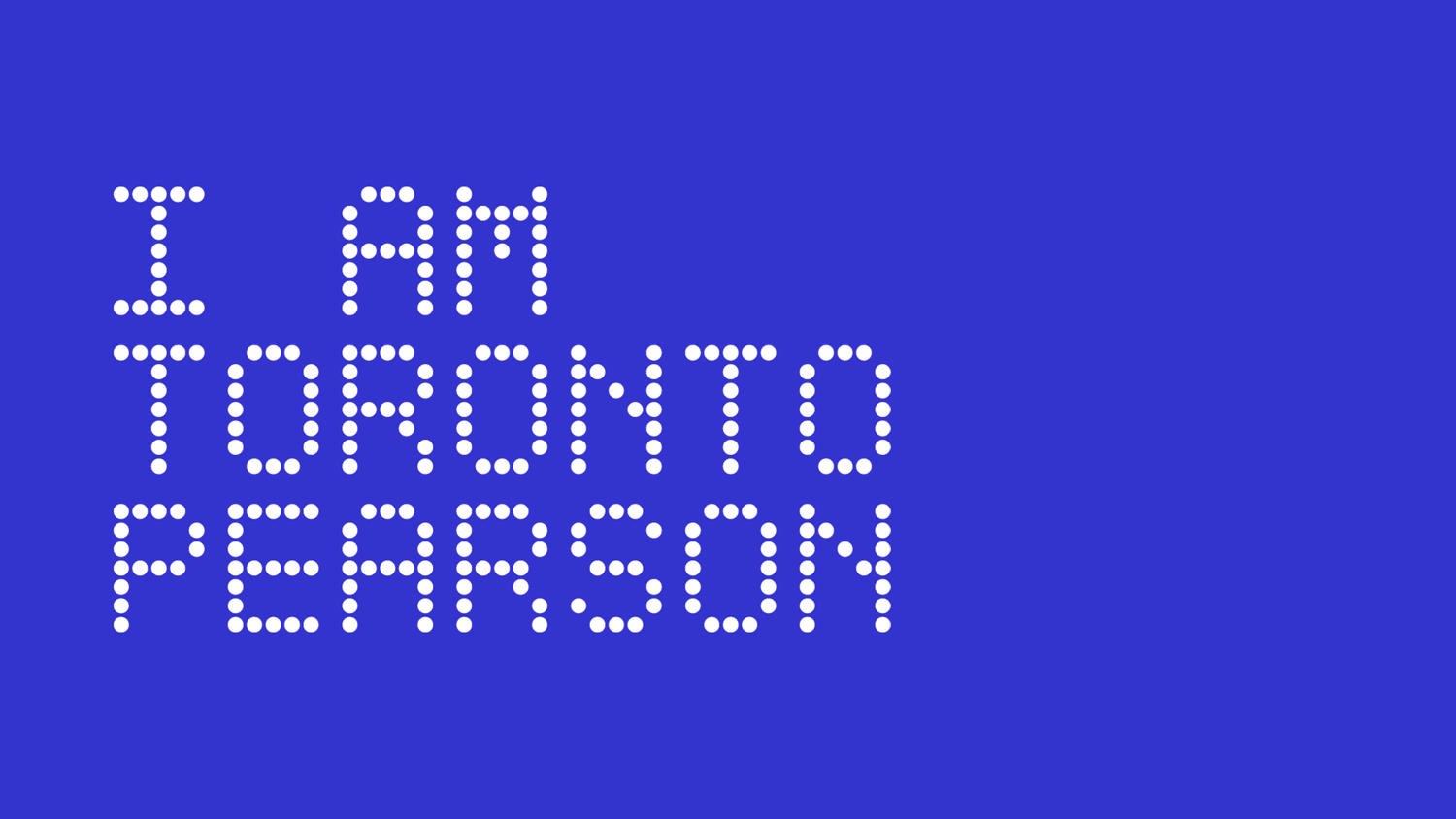
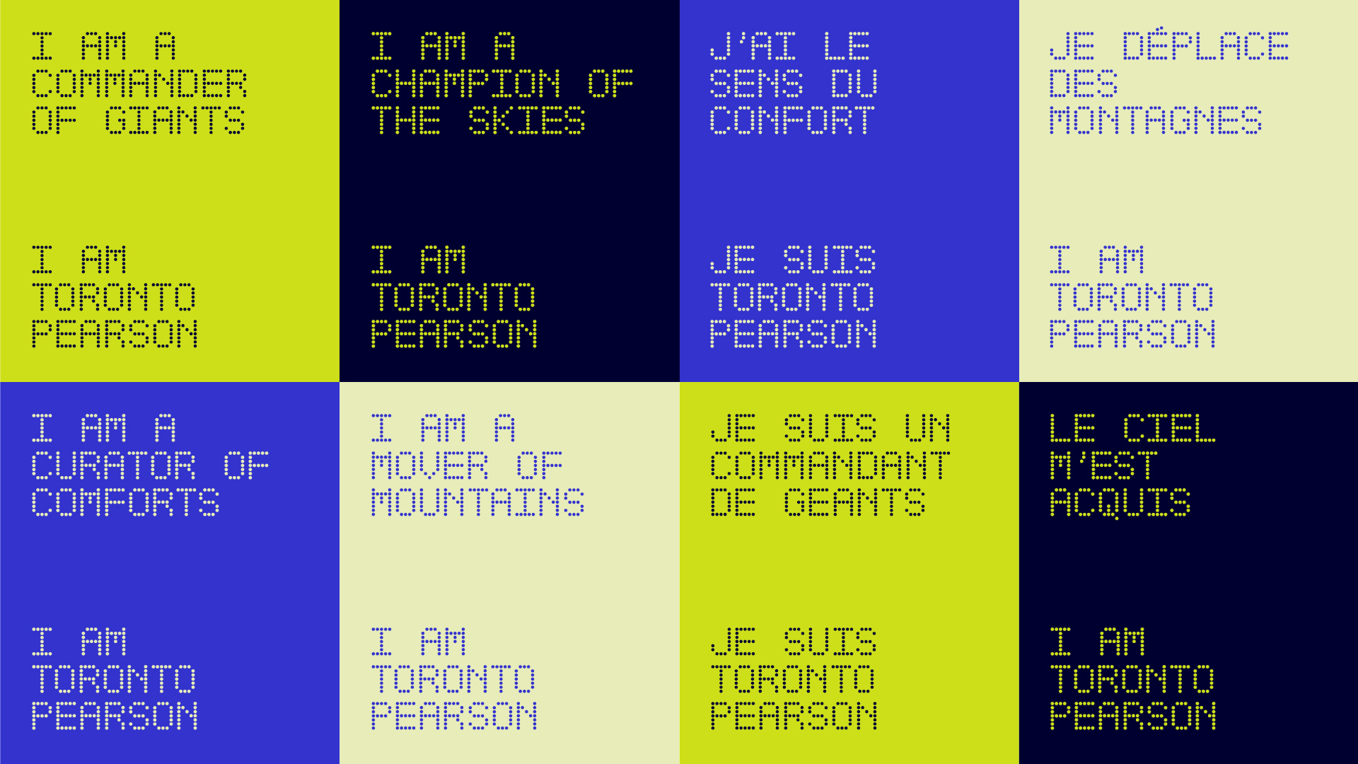
We took inspiration from athletic brand advertising and promotions in professional sports to evoke a sense of heroism, camaraderie, and energy into the IATP look and feel. Through its photographic style and taglines, IATP celebrates its community and the jobs that they do. We created a custom typeface based on Pearson’s departure gate signage — a subtle reference to the traveler being the end focus of IATP.
Font?
As mentioned in the post body, and in the project link, it’s a custom font :
We created a custom typeface based on Pearson’s departure gate signage — a subtle reference to the traveler being the end focus of IATP.