

Very much needs a dark mode.
an option for dark mode should be priority for any mobile app. suprised there’s no option for Fitbit yet
Dark mode should be mandatory and blind my vision mode the afterthought.
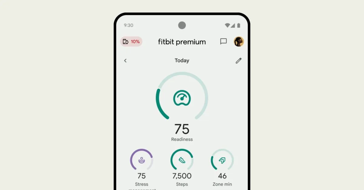
Yeah, I don’t know how I feel about the new app. The old one was basically the same but still somehow a little interesting. I don’t know if it’s the new font, or the sickly grey-green they decided to use, but the redesign just looks kind of anemic and sad.
And yeah, the whitespace sucks, everything is so spaced out and you have to scroll. I always thought good web design (and now app design) was ensuring all the important stuff was visible before having to scroll. Google has apparently gone to a rival school where the tenet is “always be scrolling”.
I’d personally like to see a customizable open-source alternative to the app without the push toward subscriptions.
the redesign just looks kind of anemic and sad
I completely agree. I really liked the old design - it was bright and engaging, information was right where I wanted it, and there wasn’t a ton of whitespace. The new design looks like it’s meant for the elderly - everything is so big and cartoonish. Hate hate hate.
The app is practically begging to use Monet color theming like other Google apps and I have no idea why it doesn’t.
On top of that, while I don’t entirely dislike the new UI, it’s now inconsistent. When you log food, it still uses the old layout, which just makes it feel jarring to go from one theme to the other.
And while they’re making tweaks to their UI, they still haven’t addressed some really basic shortcomings. If you log a meal on the wrong day, you can’t just move it to the correct day. You have to delete it and re-add it. The “recent” meal list keeps meals at the top that you may not have had in months. And if you accidentally add a meal on a future date (why that’s even possible is beyond me), there is no way to access it to remove it until that date arrives.
I’m pretty sure they removed manual activity entries which seems weird to gut
I can still manually add activities:
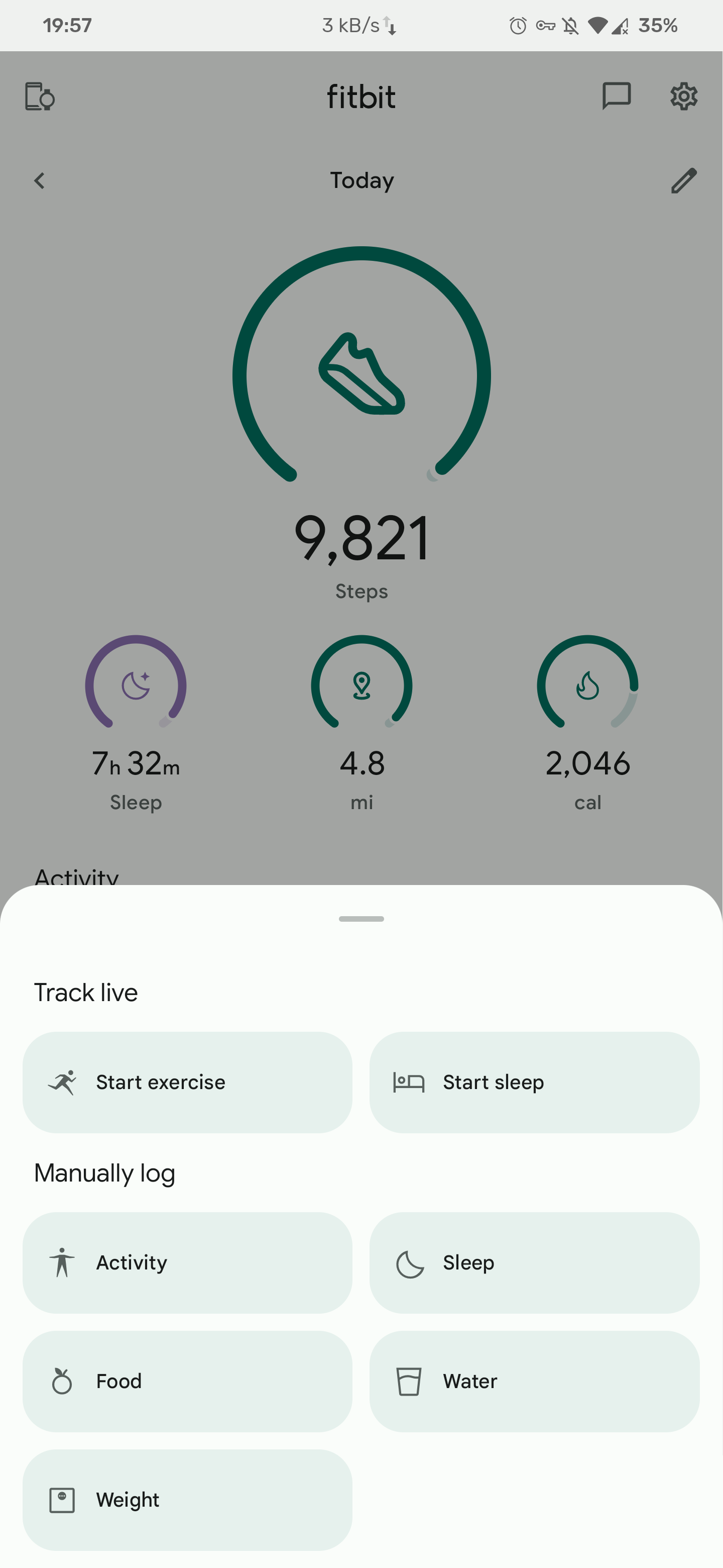
I cant, which is annoying since I know sometimes on long drives it’s counted thousands of steps and I’ve manually logging “driving” cleared them out
it could be a phased rollout with the new UI but this seems like such a weird thing so roll out in stages
I agree that this app needs dark mode, but if I had to guess, it’s probably not that hard now that they’ve started adopting Material You in the app.
Famous last words obviously
Too late, already moved to Garmin after my third dead Charge 5 in ~1.5 years.

